
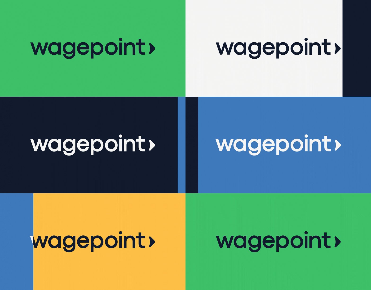
Wagepoint Brand Refresh
An 8-month rebrand to evolve a beloved but overly playful identity into a confident, scalable brand system. One that earns the trust of Canadian small businesses without losing the warmth that made Wagepoint human.
Client: Wagepoint
Role: Creative Director & Design Lead
Scope: Brand Development, Website Design, Design Systems
Contributors: CRUE agency (concept), Marcia Bianchi (graphic design), Guillermo Navarette (web development), Roneilla Bumanlag (product design)
The Ask
Wagepoint's brand was too casual. Full illustrations, washed-out colour palettes, a tone that undercut the credibility the business needed to grow. The identity wasn't strong enough to support the company's next phase. We needed a system that felt trusted and professional while preserving the warmth and simplicity that defines Wagepoint.
The Approach
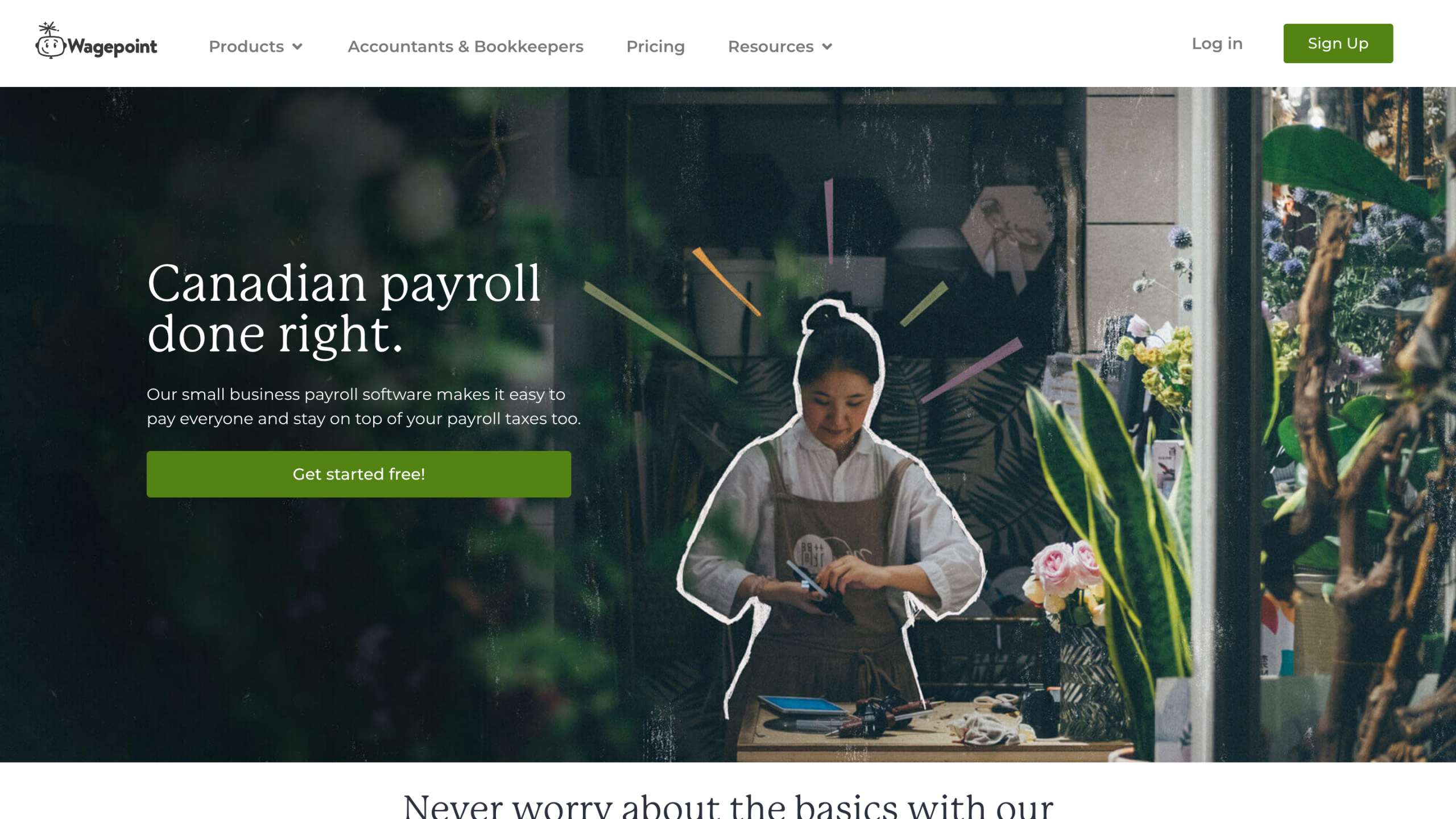
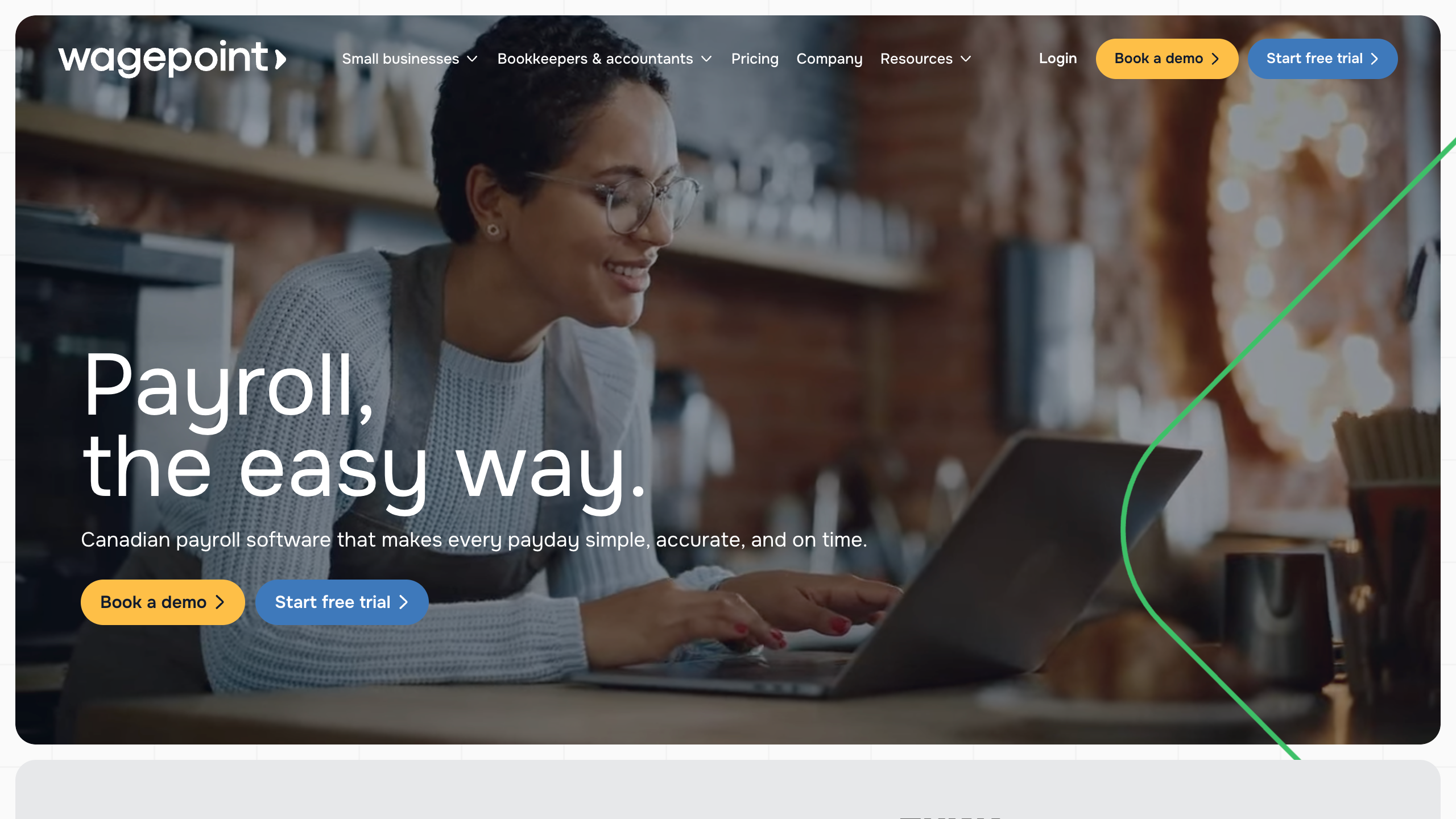
I partnered with an agency for initial brand concepts, then led all execution in-house as Creative Director. We refined the visual language – typography, colour, iconography – and extended the system across marketing and product. The WordPress site was completely rebuilt with scalable, repeatable patterns so the marketing team could work independently and fast. A full template library was created for omnichannel consistency. The full brand system was codified and is publicly accessible at brand.wagepoint.com.
The Results
The rebrand was well received throughout the industry and showed immediate effects for our acquisition efforts, including a 4.2x increase in branded search conversions, a 14% company growth in Q1 post-launch, and a website experience that loads in half the time for visitors, performing 2x as fast as our previous site.